Re Sauna
Re Sauna is Winnipeg’s first infrared sauna studio and provides a quick, private getaway where one can focus on peace and healing.
As a new business, Re Sauna needed a brand that was as refreshing and calming as the space and the services.
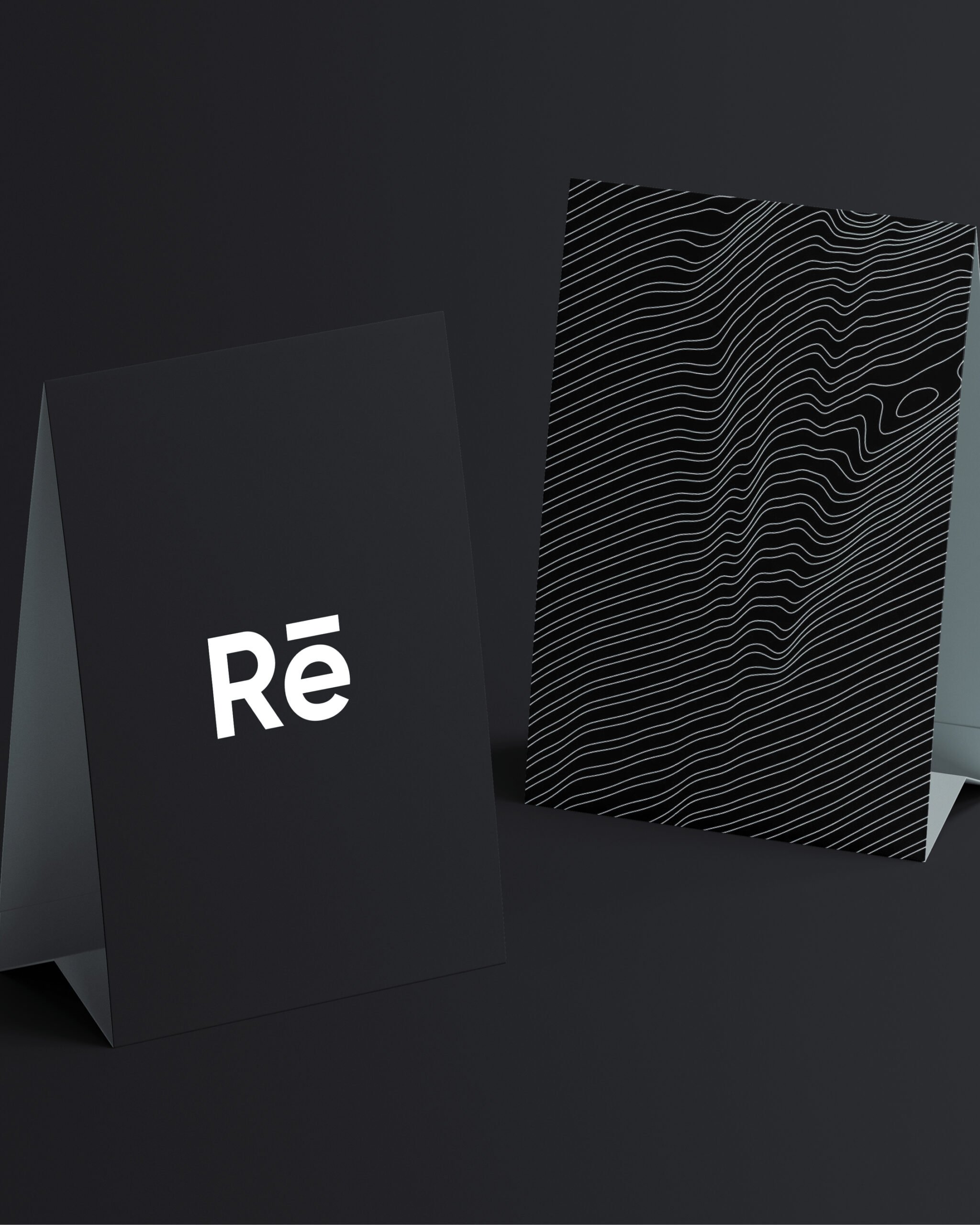
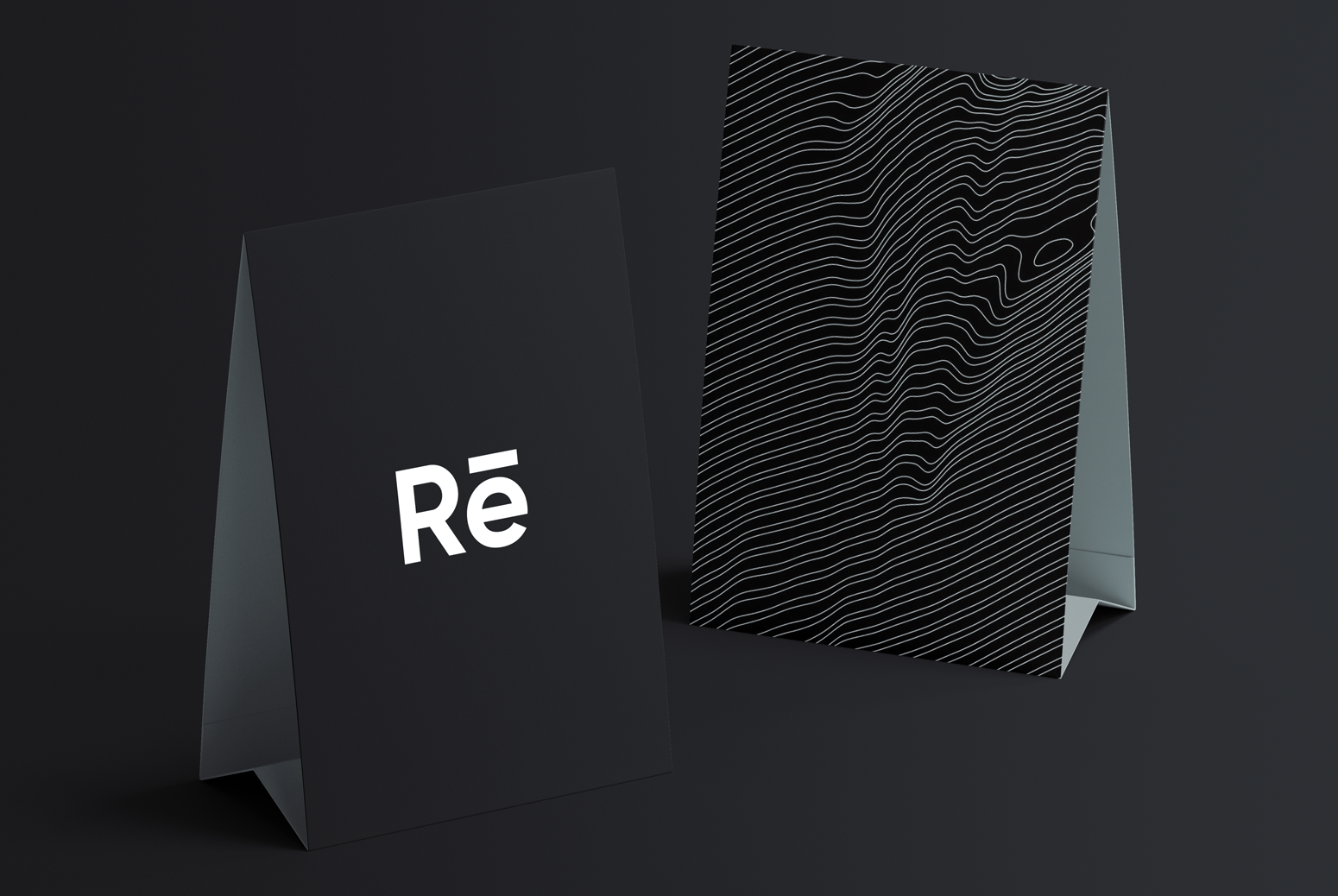
To accomplish this, we experimented with simple typography solutions paired with simple colour palettes. As the interior aesthetic became clear, we emulated the black-and-white materials being used. Studying the similarities between infrared waves and bodily pressure points, we created a series of ‘wavelength’ patterns for the branding, giving the materials a cohesive and sound aesthetic.
Services
Brand Strategy, Brand Development, Brand Identity, Brand Collateral
Instagram
@resaunawpg
Website
resauna.ca


