Canada is a beautiful place, with many, many cultural complexities. There are countless well-spoken ‘authorities’ on this subject, authors and writers with a much more articulate way of speaking. So if you’re looking for divine enlightenment, you’re not likely to receive it with this post. Instead, we would simply like to share (and elicit) opinions on a subject near and dear to our heart, one which tightly knits together many of our prides, joys, and fears; Canada. Our country. Our birthplace. 145 years old, and yet somehow still a mystery to the world.
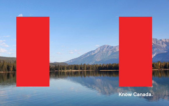 This brings us to Know Canada, a brand identity project aimed at solving Canada’s image ‘problem’. Spearheaded by Studio 360, and conceptualized by Bruce Mau Design (who’s Incomplete Manifesto for Growth has been on my desktop for over 6 years, literally shaping my life), it means to solve our image ‘problem’ with the US and abroad. It’s often said, and we have certainly experienced this firsthand, that when Americans (and the world) think of Canada, stale and cliche ideas come to mind. Maple syrup, hockey, snow and beavers are but a few commonly heard sound bytes. And while in this province it can be accurate, this is small thinking, and largely misleading. To take a quote directly from Know Canada, ‘These images don’t pay homage to the intellectual, creative and social contributions that Canada makes as a country on a global scale. These clichés do not accurately depict the 21st Century Canada’.
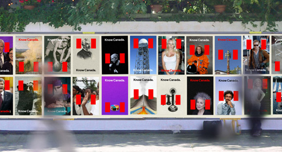
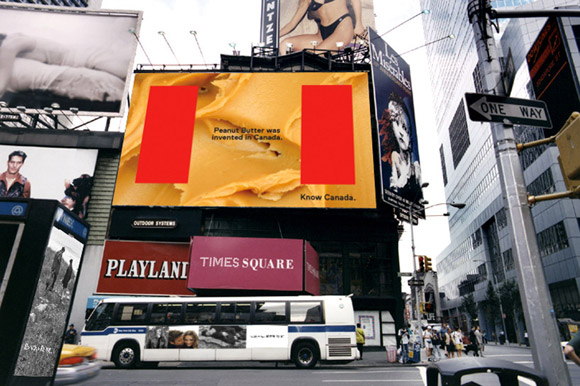 Now there are (at least) two ways to look at this. The simplest is to accuse the world of ignorance, while the second is to gaze deep into the mirror, search for our soul, and attempt to communicate just who we are. Know Canada is opting for the latter. It’s creators believe that Canada doesn’t need a re-design; rather, Americans (and the world) need to be educated. Speaking from direct experience now, our travels overseas, as well as our many relationships South of the border (business and otherwise) have re-inforced this idea. A German friend once told me ‘We have breweries older than your country’, a Swiss friend ‘Is Canada not a part of the US?’, and an American friend ‘Winnipeg, is that near Toronto?’. If they say perception is reality, then this is hard evidence to argue against.
 Now this campaign is not without flaws, but what drew me to it is something I’ve felt since I was a young boy. Something so simple that it’s been long taken for granted, yet it is still incredibly effective. The Canadian flag. More specifically, the power of shape and suggestion it emits, and the unusual place it takes when compared to it’s various global comparisons. This is the reason I feel that Know Canada has real potential. Not the images it depicts, not the attitude towards needing global celebrity, and not the assumption that collectively the people and places depicted give us a deeper meaning. Simply the fact that our flag, and the two powerful red bars that book end it, can have so much impact.
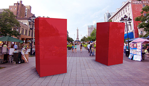
But of course this is only one man’s opinion. On the eve of the XXX Olympiad, in the year 2012 where each and every country is trying to assert it’s place in a digital world, it has us curious. What do you think of Know Canada? Is it well-timed? What about it’s execution? If you’re Canadian, does it speak for you? If you’re from America or abroad, does it speak to you? And finally, if you’re a graphic designer, does it work on a global scale? There are no right and wrong answers, but if you have some, we’d love to hear them. – Tyler